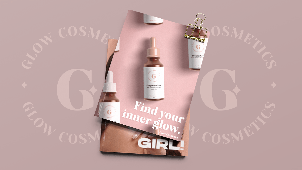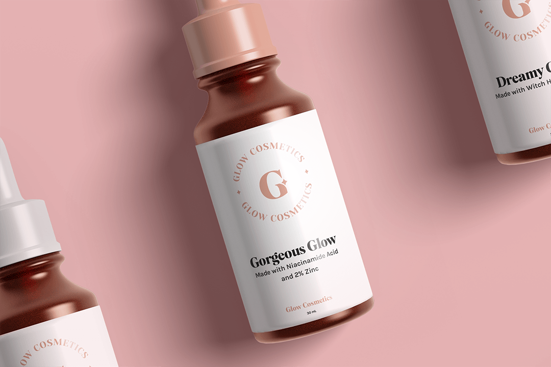
Glow is a cosmetics brand that takes pride in being a Filipino organic brand. It creates make-up products that is especially fit for Filipinos. It has been in the cosmetics industry for 5 years and is now expanding. It will now have an organic skincare line that offers naturally made products at budget-friendly prices. The brand empowers women to make a statement and flaunt their individuality by bringing out their inner glow. All products are free from harmful chemicals and are gentle, safe, and effective.
The goal is to be able establish a strong brand identity and emphasize on the product line expansion. The aim is to gain more brand awareness. I want to be able to communicate the new skincare line of the brand to the audience. The brand is different from the competitors because it offers affordable organic products that is safe and effective and will help with several skin problems.
- 18-28 year old women
- Classes B-C
- Undergraduate college students or young professionals
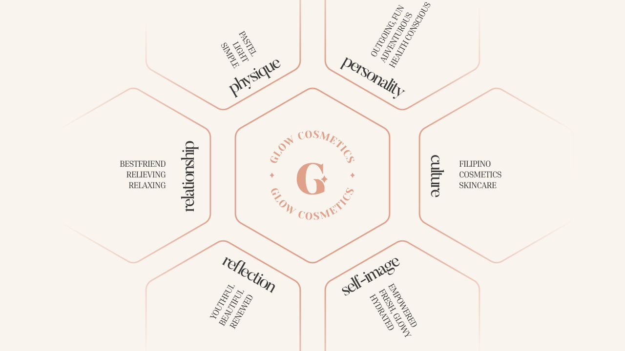
The above shows the brand identity prism for Glow Cosmetics.
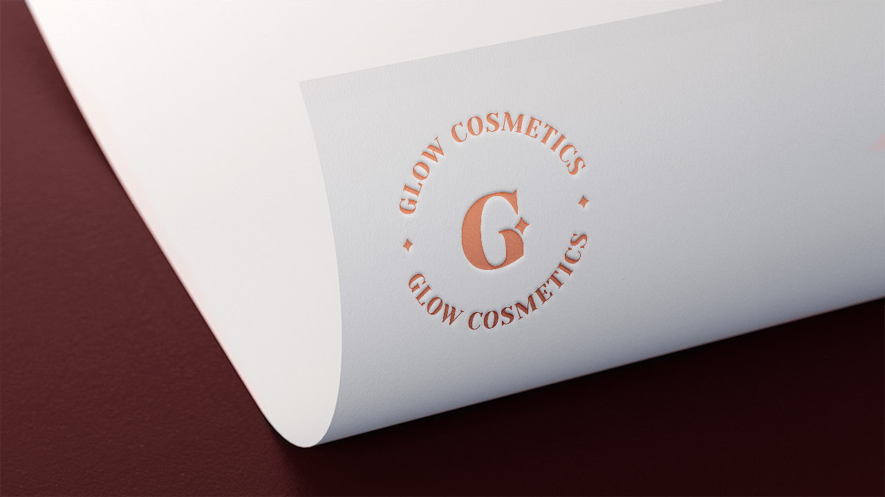
With that, I created the logo with a simple, relaxing, and fresh feel fit for a Filipino cosmetics skincare brand.
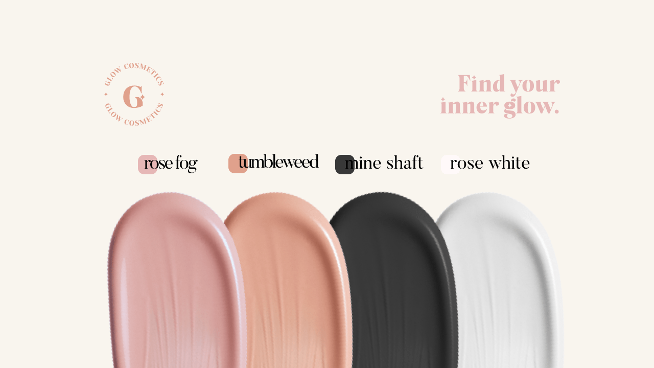
I then developed the rest of the color palette, using rose fog and tumblewood as the main colors, and adding mine shaft and rose white for neutrals.
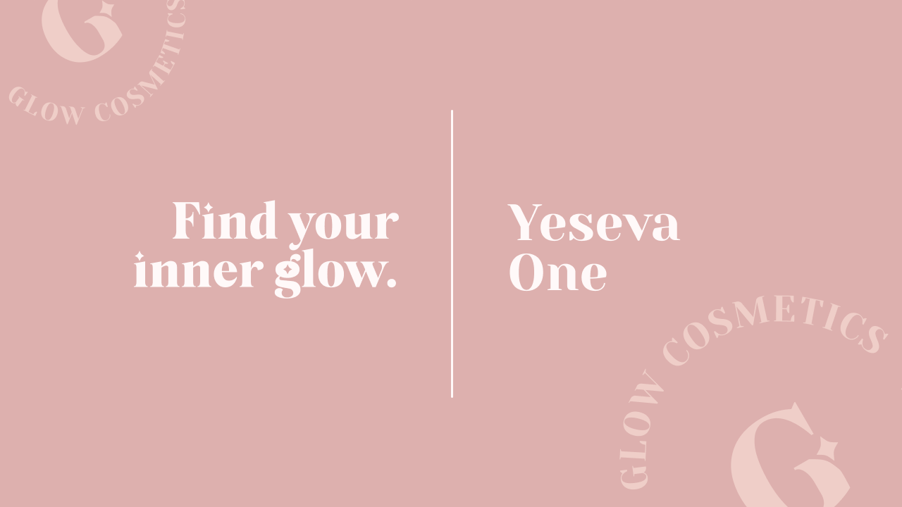
I also settled for Yeseva One as the main typeface for the brand. The serif feels luxurious, but still friendly and relaxing on the eyes.
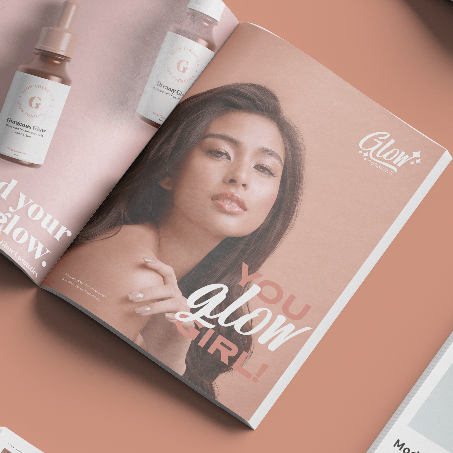
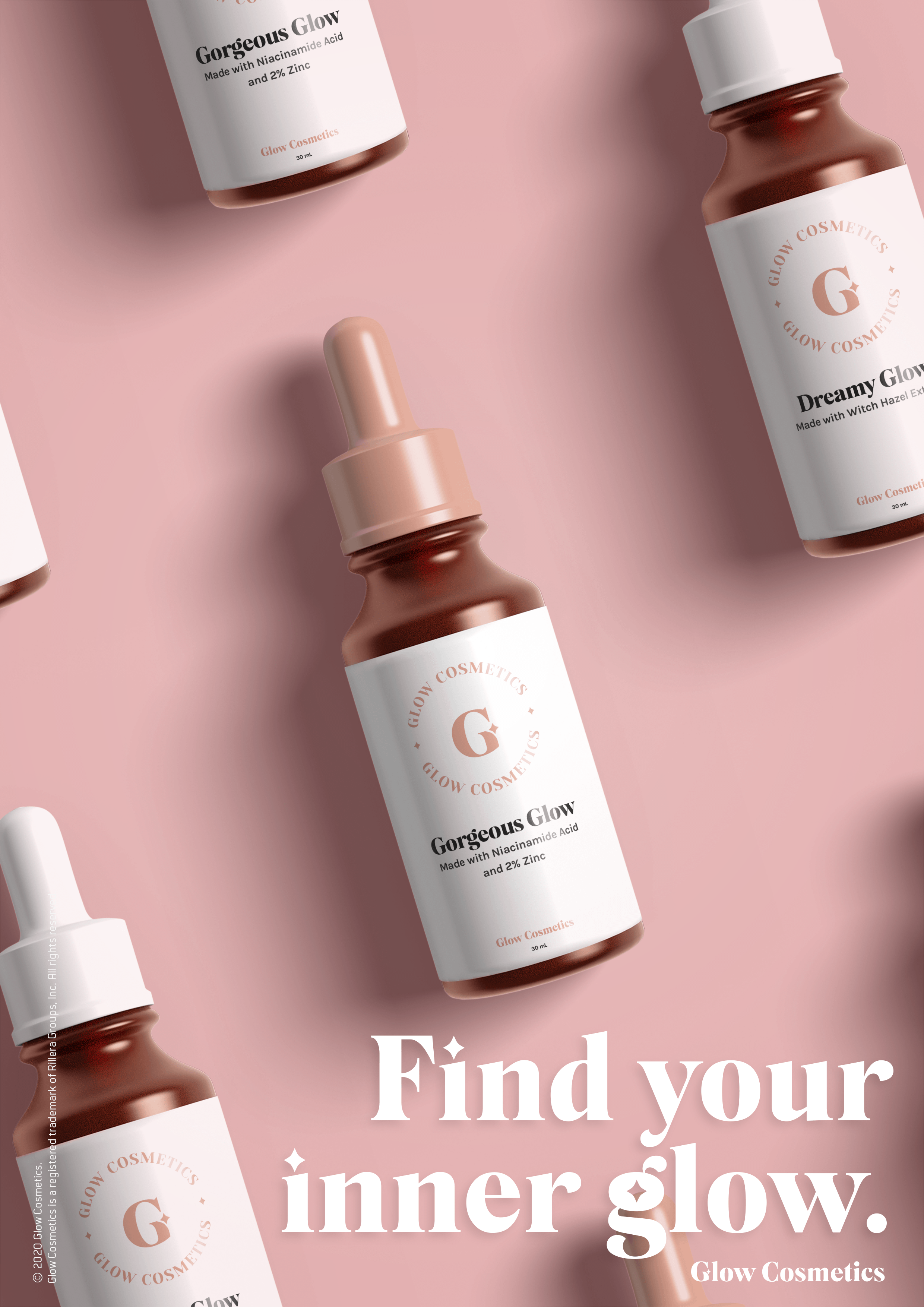
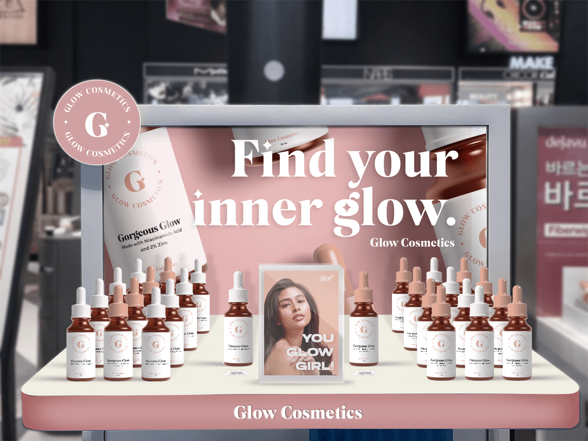
Now, our task for the was to create two print designs based on the client brief provided to us. Additionally, our professor asked for one mockup wherein we could see the product displayed on shelves.
Thank you so much for reading until here! 🤍
